The v1 of any product is (hopefully) designed to be simple and straightforward to use, allowing users to jump straight into the product and start using it, deriving value from it in minutes. This key ingredient of simplicity and ease-of-use is what makes-or-breaks a v1 product. But assuming that your product has jumped over that hurdle, and you've had some initial traction with your product, there's a big choice that comes next.
And the choice is whether to design the next versions of your product for simplicity, helping onboard new users, or to design for the power user, helping existing users extract more value and productivity out of your product. This choice is somewhat complicated, because new users will eventually get used to your interface, and when they want more "power" features, and you've hidden them under menus and preferences, it gets annoying for them. (what are power users?)
In its early days, Google had consciously made the choice to "design for power users". For example, Google Search has several special operators - Like using quotes, "not" and "or" logical operators. (Did you know that you can even specify a date range for your searches by using a ".." operator?) Similarly, Gmail has had keyboard shortcuts for the longest time for power users, but they are so well hidden inside the preferences, that you're unlikely to easily find them. This balance worked for Google because its search algorithms were so good at just understanding what you were searching for, it didn't need users to use the advanced operators.

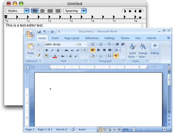
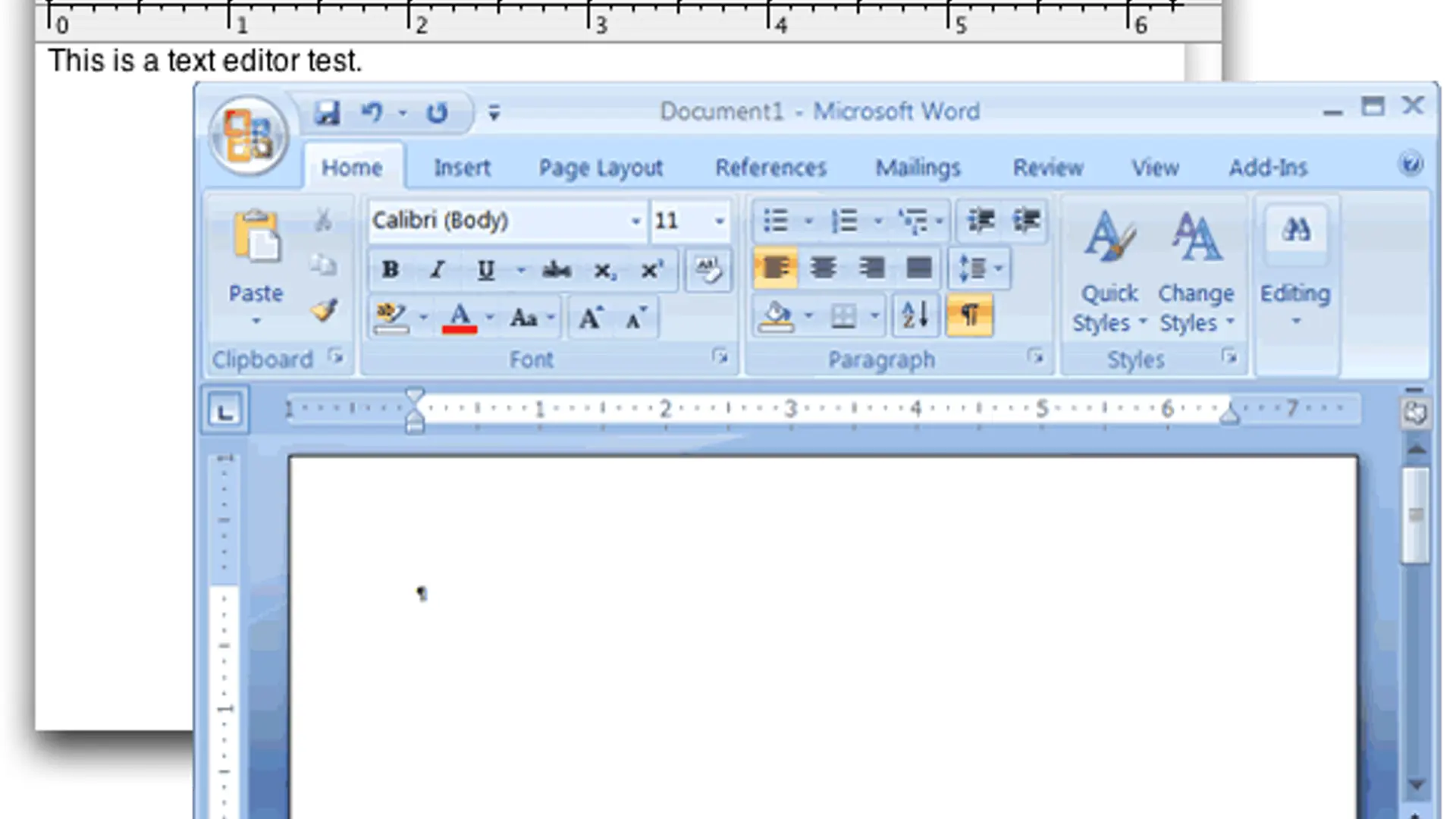
On the other hand, think about how Microsoft Word is designed. If you were a first-time user of word processing, Word would be very intimidating. In fact, this applies to the whole MS office suite. It is consciously designed for Power users. If you have a lot of experience with Excel, it can be an extremely powerful tool, allowing extra-ordinarily complex calculations to be performed without writing any code. Microsoft's bet that most office workers will receive formal training on its office suite has paid off handsomely, with MS Office is pervasive around offices and businesses around the world.
With Office's designed-for-power-users approach, all other competitors that aim for simplicity/ease of use/intuitiveness in the office software market are perceived as "low quality" and "lacking in features" that no one else has been able to break into the space.
With the shift to Mobile devices these days, most apps are being designed for new users - Making them extremely simple to use and making on boarding new users the goal. However, is it possible that when users have been using the app for a while, are very familiar with the interface, they'll be looking for more advanced options, but won't find them in the app and will get disappointed? Is there then a possibility for a more powerful app to come in and displace a "simpler" app?
This is an interesting experiment that I'm looking forward to seeing played out in the mobile app space.


