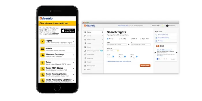
Cleartrip is not going app-only, gives its mobile web a makeover
There has been a lot of debate about going app-only. Many e-commerce sites have shut down their mobile websites and the future of mobile web is being discussed actively. Myntra recently conducted an open mobile hackday pushing the app-only envelope, and Flipkart is of course backing the move. Other e-commerce biggies like Urban Ladder are also in favour of the move but there is one company that is clearly not in the favour of going app-only. Meet Cleartrip. The company says,
There is a trend of brands shutting down their mobile sites in favor of mobile apps — they claim it is due to the overwhelming effort required to maintain all products across multiple platforms. We think that’s a terribly weak argument coming from companies that have no dearth of resources at their disposal. We’re committed to keeping Cleartrip accessible so our customers can use the channels they prefer.
Cleartrip wrote a post about how they have revamped the mobile website. We got in touch with their CMO Subramanya Sharma to learn more.


YS: The yellow on the mobile web looked pretty good. Why the shift to blue? Is it because all airlines have a blue inclination? SS: Yellow was never an intended part of the product experience at Cleartrip as it is a bit distracting. For advertising however, it still remains a core part. We actually moved to using the blue on the desktop a few years back when we rolled out Project Tuxedo – the all new Cleartrip experience. Then onwards, we’ve chosen to take a consistent design approach across all channels and that’s how we intend to keep it.
YS: The blog mentioned that the mobile web revamp took two months, how many people were involved?
SS: It was a few people for a couple of months.
YS: What is the mobile web traffic for Cleartrip, what does the trend show?
SS: Right now, mobile web contributes to 47% of mobile traffic. The rate of growth is similar to that of the apps.
YS: What do you think about the app only attitude? Where is it going?
SS: From a financial standpoint, apps makes a lot of sense - life time value, conversions, and retention etc are all much better than the mobile web. Apps will continue to get a lot of mindshare from companies because of the above reasons. There is also a customer angle to this – consumers have space and time constraints, and we believe that they need to decide whether they want to use a brand on the mobile browser or as an app. At Cleartrip, we have always been fanatical about user experience, and so, users will have the freedom to pick their platform of choice. We will continue our efforts to keep both the web and the app environment for our users, and strive to make them better.
YS: How does the mobile trip at Cleartrip operate? Is it a separate one from the app team?
SS: The desktop/mobile web team is the same. The app teams are separate.
YS: What's on the roadmap?
SS: The mobile web and desktop roadmap will be similar, and will continue to evolve. Customer service will get special attention on the mobile web as that is a great platform to solve some of the challenges around the same.
Read the detailed account of the makeover here.


