“Make it Sundar!”
The reference is not to Mr Pichai. Sundar, or beautiful, is one of the several explicit design goals stated by Indian startup teams.
As the VC firm SAIF Partner's resident design-guy, I work with startups, meet founders, product and design folks every week. For most, the word design almost always evokes the idea of beauty, prettiness, visual order. Nothing wrong. Just that the way design works in tech and in tech startups is very different.
Design has a pivotal role in helping startups find their ‘fit’, to help them transition from being useful to usable to delightful and possibly, habit forming. Whether you’re the CEO, CTO, part of the core-team or the lone designer, avoiding these 5 common mistakes will go a long way in creating a user-centric and a design-savvy startup.
Mistake #1 Design is about pretty
When I graduated from design school, the print world was going through its high-resolution digital renaissance: insanely hi-dpi scanners, brand new digital typefaces and whatnot. While transitioning from print to web before the turn of the century, the fonts, the breaks, the image quality, while optimising were so 'un-pretty'.
What stood out was the vast difference in the underlying construct: print was linear. Users had a single storyline. Design for interaction meant that the user had multiple storylines, and more opportunities to get frustrated faster.
In technology design, the real beauty comes from elegant, thought-through pathways created through a combination of design, product and technology to help users achieve their goals seamlessly.
Spot it:
The team’s focus is more on minor visual details than on user goals, intent or engagement
Ways to avoid it:
1. Have a clear idea of user goals and intent. Define what success means to a user and how design helps her/him achieve that (see example below).
2. Remember, users may not just be consumers. Rivigo, a startup I work with closely in the logistics space, has multiple users – from sales executives to ops staff, pit-stop supervisors to truck drivers. Similarly, delivery or foodtech apps aren't just about the consumer layer – can we help the delivery boys be successful?
3. Look for ways to measure engagement. Be a 'fly-on-the-wall', observing users as they go about doing their work, instead of bombarding them with questions.
Bottomline: Pretty is a by-product, and not the intent.
Mistake#2 Design is a garnish
“We’ll involve you once we have worked out the details”. These words aren’t alien to designers, in startups or even mature MNCs. Designers are often brought in after engineers, product managers and business owners have done their bit, to add the ‘garnish’.
Early design involvement gives the product an edge, because it questions the nature and the boundaries of a problem we are trying to solve, not the solution.

Every week I do Design Office Hours for startups across our portfolio and beyond. A common pattern I find is that users and designers are often at the end of a long list of people who have had their say in defining the product. Some startups have polished UIs, sleekly engineered products and features but the product-market fit eludes them. User centric thinking (not blindly ollowing the user) is at the heart of Good Design – and what distinguishes Design from Art.
Spot it: Other functions to design: “Working out the details, let’s discuss once it’s done!”
Ways to avoid it:
1. Design thinking isn’t just a certification. It’s a way of approaching problems from a user-centric perspective on top of which will sit multiple layers of code, product and marketing decisions.
2. Don’t rush into solutioning: whether writing codes or creating mockups.
3. Develop quick hypotheses around approaching problems and intended solutions. Importantly, don’t fall in love with the solution. Not yet!
4. Startups need to test out the hypothesis with limited sets of users in the environment where they’re likely to use the product.
Bottomline: Factor in Design & Design-Thinking at the start
Mistake #3 Design Democracy
Everyone has deeply subjective opinions on design:
On colour (That Orange looks 'dirty')
On typeface (Proxima Nova is the best)
On home screen (This looks stupid, look at Airbnb they're awesome)
Designers in early-stage startups undoubtedly get to hear these from the C-suite and other team members. Then there are the impromptu user opinions. Many people commenting on design don't have the context or imagination to see how a design idea might scale; and some don't have the ability to articulate what is missing. Often, the design issues pointed out are symptomatic of other issues. User research is both essential and powerful, but how the research is conducted, at which stage, with what sample size and in what setting - determines the output. The idea is to gather insights around usage patterns – not just opinions or sound bytes.
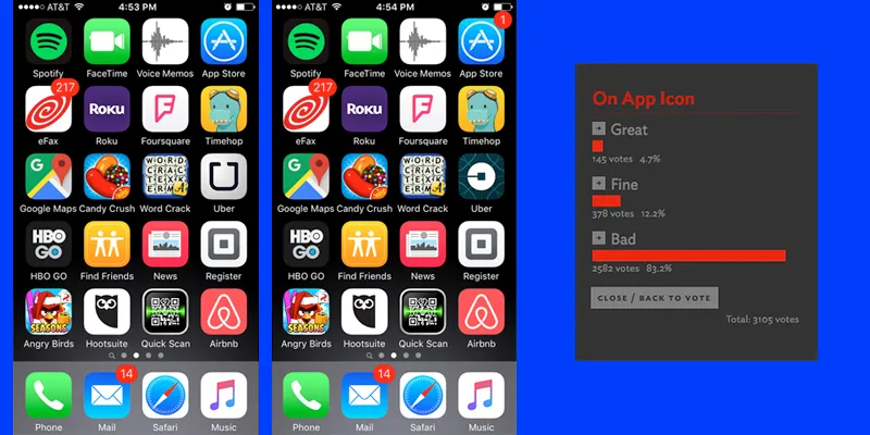
Spot it: Too many (unqualified) subjective opinions.
Ways to avoid it:
1. Designers are responsible for articulating the work they do in terms of objectives and outcomes.
2. Teams have to get better at qualifying and articulating their feedback.
3. Remember that the Facebook or Airbnb you see today wasn't the same at the time of launch. The site and apps are a reflection of a business that is maturing, learning and unlearning.
4. Listening to users (or the team) is great, but being too overtly influenced has some downsides like “being held captive by your customers”.
The bottom line: Design isn't a democratic process, neither is coding or commerce.
Mistake #4 Designing for Dribbble peers
Designers are a tribe apart.
We're often found drooling on dribbble, Behance, DesignerNews, Slack channels, Facebook groups. The number of likes, views, shares resonates with designers. As do trendy, designerly apps.
Take the case of Clear, a much-awarded lists/organiser app. Designers love it. Though the experience is highly differentiated, one wonders if this has made Clear the market leader in any way?
The question is, how can good design be equated with good business? The app interface is not enough. On a daily basis, we encounter app interfaces we like and use, and eventually take our business elsewhere. Sites like dribbble show droolworthy interfaces and micro-interactions, but not how a business problem was solved elegantly, or how it all comes together.
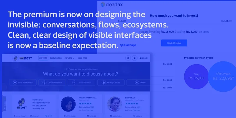
Some of the most interesting and challenging problems are also unsexy: the tax forms of Cleartax, the tablet apps that the Rivigo pit-stop supervisors use or the CRM systems of Autoninja that telecallers use 8 hours a day. These are core to the business and also present unique design opportunities, independent of the trends-of-the-day aspect.
Spot it: Spending too much time comparing trends
How to Avoid it:
1. Understand what impacts users the most and what ultimately impacts business. Question if they are being measured. Make data your friend—but not a crutch.
2. Remember that design isn't just the interface – there are multiple elements from branding to marketing to social media presence. Even if it isn't your domain, get involved. See, read, question and find the relation between all these manifestations of design.
3. Designers sometimes do not engage with the content. The exact list, the tags, the body copy, error messages – they all matter.
4. Do what is good for the users and impacts business positively, not what gets most kudos from another designer or likes from the design community. Remember, design trends have a short shelf life.
The bottom line: Don't design for dribbble or peers, design to impact business.
Mistake#5 Designing Wow Features
When I met Srini (not his real name), six months of engineering effort had been put into his site and app. He and his Product Manager demonstrated the ‘wow’ features. The problem is, it just didn't add up: the users weren't coming, or staying. Or not the intended users anyway. Srini hadn’t spoken to users until recently, and conversations suggested that they were getting overwhelmed.
When teams become ambitious, they can go overboard trying to craft perfect features or being tempted to add one more detail before they launch. Design to learn, launch early and keep iterating is the mantra.
Spot it: The love of more – more features, more details
How to Avoid It:
1. Design for short user journeys at an early stage – put a cap on features and focus on seamless flows, especially in this age when we need to negotiate through multiple logins and APIs.
2. Ensure users complete a task and have reasons to come back for more.
3. Add on to the complexity or depth only after a particular journey is tested and resonates with the users.
4. It’s great when users come back with a feature request, which you have thought of but not implemented, as opposed to users finding it complex.
5. Find some early adopters and keep the conversations going with them.
Bottomline: Design isn’t only about ‘wow’ features. Learn about user preferences and behaviour
Everything is connected
Often, the late involvement of designers implies that design is relegated to ‘prettifying’. Though visual order and clear hierarchy do help users navigate better, no amount of pretty will improve a bad task flow. Again, the need to polish a feature until it is perfect (to impress peers? win an award?) goes hand in hand with delaying a release, which in turn may not help the business learn or find its product market fit in the right time.
Chances are that designers in startups have to balance multiple demands. It’s not easy, but few places provide as much exposure to real world challenges and, a chance to make mistakes and learn from them. Be focused on helping users and businesses, and don’t get sidetracked by fast-fame.
After all, all great products are a reflection of great collaborations – between engineering, product and design, between data and visual flourish, between makers and users.


