How to create a great sales page and convert leads into customers
A great sales page is essential for converting leads into customers. Visitors who have landed on your sales page have already identified their need for your product or service; all you need to do at this point is convince them to buy it. But that is never an easy task. Potential customers want confirmation that what you're selling is good and that others have bought, and benefitted from, it. Here's what your sales pages need to persuade potential customers into buying your products:

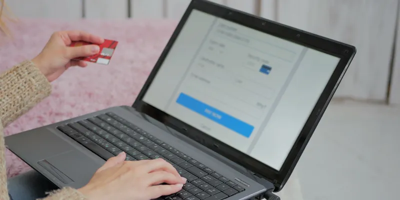
Image : shutterstock
Good design
The sales page gives the first representation of your product to potential customers. No matter how good your product or service might be, if the sales page design is not appealing to visitors, they will naturally assume that your product isn't going to be very good either. Designing a clean and attractive sales page, devoid of unnecessary clutter and clashing colours, will instantly prompt visitors to stay on the page instead of exiting it immediately.
Clear headline
The headline is the first thing any visitor will read on your sales page, and an effective headline is what will keep them reading on. Drafting a clear headline, one that describes your product's USP in as few words as possible, will tempt your customers into reading more about it. While creating a headline for the sales page, remember to use enticing, emotive words but be sure not to go overboard and make it sound like a click-bait.
Appropriate content
Visitors who land on your sales page have identified a problem in their lives and have recognised your product's potential of solving said problem. The content on your sales page, therefore, should be aimed at providing a clear example of how your product will benefit its buyers; do not simply advertise the product, tell a story that describes your customer's pain and how your product can alleviate it. Also, provide customer testimonials (accompanied by images if possible) as they are invaluable in building the credibility of your product or service.
Captivating image or video
Just as visual content is king on social media, it can prove to be the make-or-break element on your sales page. A clear and captivating image of your product can convince potential customers of its quality, while an informative video does the same for intangible services. In the case of images, making them interactive (scroll transitions or GIFs) adds an exciting dynamic that engages people more easily. You can also make use of small icons to elaborate your product’s features in an easy-to-read manner.
Clear call-to-action
The CTA is what your visitors must ultimately click if they are to become paying customers. If every other element on your sales page is perfect but visitors are unable to easily find the CTA, you run the risk of losing a potential customer. CTAs should not only be clearly visible, featuring bold colours and clean designs, they should also have a unique copy that entices visitors into clicking them. You can also offer them a free preview or trial of your service in exchange for their email address, which can then be used to market to them in the future.
No redirects
Your sales page should be the last stop in the buyer's journey. It should have everything needed to convert a sales lead into a customer. All the last-minute questions and worries a potential customer may have about purchasing your product need to be addressed on the sales page. If customers need to click on outbound links for details such as FAQs or product warranty, it increases the possibility of them not returning to the sales page and ultimately buying your product.
In summary, your sales page should be visually engaging, informative, self-sufficient, and above all, it should be about the visitor (specifically their problems and the immediate need for a solution) and not the product.


