9 ways you can design a winning and engaging UX
According to a 2017 study by mobileinsurance.com, a person spends roughly 1.5 hours a day on the phone.
While that may not seem significant, it averages out to nearly four years of his or her life. When actual usage was analysed, it was found that calling people featured only sixth on the list. While gaming and social media were top contenders, app usage featured second on the list, closely behind browsing. It should come as no surprise then that User Experience (UX) has become key to Internet product development. Simply put, a person’s UX covers his or her interaction with a product.
How did they feel while navigating and using a particular product, system or service? What did they think of the ease of utility, use and efficiency? What goes into the designing of a winning interface?
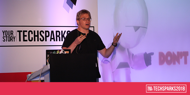
This was the subject of a masterclass UX for Engineers: Pro Tips on How to Delight your Users with Less and Why that's a Good Thing by Royi Benyossef, Ecosystem relations manager, Samsung NEXT on Day 1 of TechSparks 2018. An Android developer since 2009 and a Google Expert since 2012, he was one of the engineers that conducted app reviews for Google Play as part of the experts programme.
With over 3 million apps on the Google Play Store alone, multiple app stores and over 12 million developers, who have an idea or are working on a product, differentiation becomes key. And that differentiation usually relies on UX. What is Google looking for and what are people all over the world looking for? These were some of the key takeaways from the masterclass
1. People everywhere are just people: When Game of Thrones author George RR Martin was asked how he wrote such well-rounded female characters, he replied, ‘Well, my basic assumption was that women are people too.’ That same applies to people across the world and the UX they expect. So, the solution lies in the funnel which represents the user base. It's wide at the top because it refers to all the billions of people who could find you and the bottom of the funnel is narrower because it represents the people who have found you and are interacting with your app. And the rules to keeping them engaged are fairly universal.
2. Keep it simple: If a user has to go through multiple steps to do something simple, or if there is too much cognitive overhead (like a banking app that requires you to remember multiple answers to questions), chances are they will get annoyed and uninstall your app. Friction is described as the effort overhead of the user, that will cause them to drop out and uninstall your app. The solution lies on four pillars – getting noticed, onboarding, handling, and performance.
3. Follow the rules: Developers should follow the guidelines laid out in two documents – the Core Application Quality Checklist and the Google Design Guidelines if they want to be featured on Google Play. If you do not pass even one of those rules, chances are anyone among the 3 million + apps out there who followed the rules will steal your thunder.
4. Short isn’t always sweet: A lot of apps in India, and other places are very succinct. There's barely any description, and hardly any images, many of which are low quality. Users will be impressed and not download the app. With high-res images, logos and videos, everything becomes more fun. The second thing is to support more languages. The more languages your device supports, the better your chances of being visible on searches, not just in India, but internationally as well.
5. Simplify navigation: It’s important to understand what the killer features in your app are that will make people interested and feature those alone. Also, navigation is the number one reason for bad ratings on the app store. If there are a lot of gestures like Swipe Up and Down, Exit Full Screen, a lot of people will find it confusing and annoying.
6. Create context: Everybody has a spam email, which they use it to sign into an app, because it's not a social login. However, if it's a productivity app like LinkedIn, it is most likely that a person will use their actual email. Explain why you need that login. Every survey has shown that people are happy to share their details if there is a rational explanation. Ask for what you need, not what you think you can have.
7. Understand your position in the user’s life: Part of being a good Android citizen is understanding your app’s position in the user’s life, not necessarily about how your product serves itself. In India, people use the phone everywhere, and applications need to keep that in mind. It’s worth bearing in mind that the highly technologically advanced and those who have a limited understanding of tech will always prefer apps that are native to the platform over cross-platform apps.
8. Know your notifications: While push notifications, great feature on all phones, it’s highly abused by developers usually because many don't understand how annoying they can be. There are four basic types of notifications: There are the
- incoming notifications: SMS/WhatsApp/Phone call alerts
- synchronisation: notifications on email that you got or if someone shared a document your Google Drive
- announcements: a new episode on Netflix; new tweets
- alarms: alerts, reminders, etc.
There are four intents behind these: fun, VIP (specific to you); nagging, mission critical. Be honest with yourself and identify which category of notifications you are sending out. Identify and adjust the way you are sending out notifications and allow your user to react conveniently. And never spam them.
9. Failing gracefully: This is the best thing you can do. Clients don't care that you failed, as long as you acknowledge it in a playful way. The second thing is to be aware. Understand your users and adapt to their needs based on what they need.