
Common UX pitfalls to avoid for mobile app design
The mobile app development industry has started buzzing around researches by digging success factors for a mobile application. With this, the statistical analysis has coined one significant term for mobile app developers - User Experience (UX).
In present times, the mobile app market is very much competitive and even experienced developers with sufficient investments put in a lot of efforts in order to attract user attention. But that's not the end. You need to have a less obvious task and more crucial - hold the audience.
Also, the mobile app development industry has started buzzing around researches by digging success factors for a mobile application. With this, the statistical analysis has coined one significant term for mobile app developers - User Experience (UX). It begins at the moment when a user starts interacting with the app and always revolves around it.
Anyone in the software development industry can conclude that UX design is not a job of UI designer alone as UI designer is the beginners of the UX design process. So, any shortcomings or imperfection of interfaces can lead to user distraction. Most of the pitfalls are pretty typical and by knowing the essence of the common ones, you can clearly avoid all of these pitfalls.
#1 Inappropriate architecture and poor logic
One cannot build a good house without proper plans and drawings. Similarly, one cannot design a good mobile application without elaborate architecture, precise hierarchy, and clear logic. If you ignore this stage, then you can eventually end up on prioritizing the interface elements by providing the user with proper convenient and easy interaction with the product.

Hence, it is mandatory to think over the logic of user interaction with apps and usage scenarios in advance which should be done as early as the layout creation stage.
#2 Forcefully including the login page
We all are aware of the huge number of applications where the customer are required to log into the page after entering some important data such as name. Email address and so on. But, it is not mandatory that every app has to have a login page.
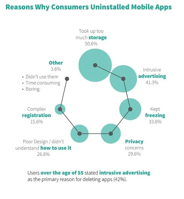
You can try to keep on pocking the customer for the registration every time the user opens your app; this can annoy them. So, give them some time to identify how the app operates and how it is useful to him. Be aware as more than 15 percent of users uninstall the app because of poor registration experiences.

Image Source: Marketingprofs
#3 Clumpsy or no onboarding
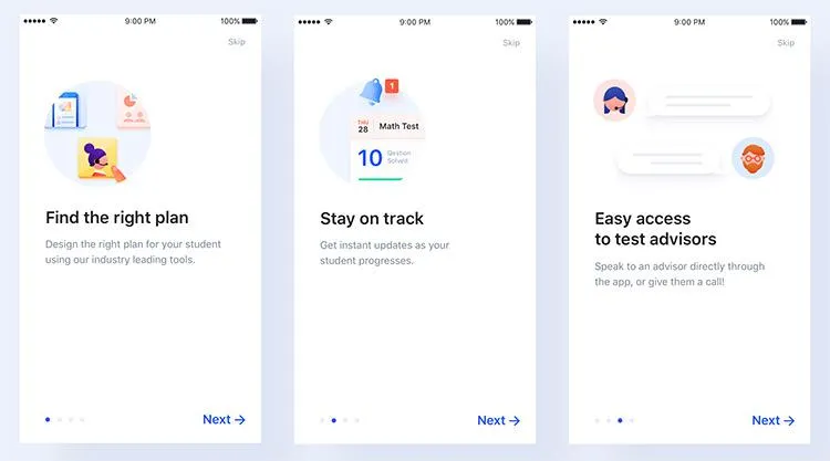
The mobile app onboarding is a thought-out sequence of screens which should be displayed to your users when they use the app for the first time with relevant hints on the interface. The initial acquaintance with the app is most vital and during this time, a person creates an impression of the app and decides whether they should continue with the use of the app or not in the future.

Image Source: lvivity.com
#4 Overcrowding and over-stuffing the app with unnecessary features
In general, it is a wrong belief that adding loads of features will generate more traffic to the mobile app and enhance the user experience. You are taking the user into the zone by creating more confusions in his mind by over-stuffing the application with too many features. Hence, it is crucial to have a proper understanding of what the app is all about, what products and services it can deal with and then proceed further.

image source:lvivity
#5 Troublesome interface
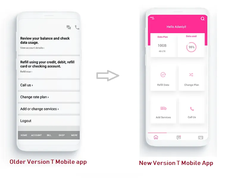
It is believed that everything that users can misunderstand, they will better misunderstand. In general practice, it is tough for any user to understand something that seems obvious to the designers. This situation can be tackled by using familiar and well-known symbols in the interface as they have an unambiguous association which won't be confused for anything else. Avoid the symbols that are not understandable or interpreted as meaning of two variant things.
#6 No deep research to understand user demand
We all know evidently that the story of a more successful user experience initiates with deep-rooted research to identify what the customers are demanding from the UX designers.
Always remember that it is tough to impress the customers with an impressive design and connect with them at the same time. Even the research factor becomes vital for knowing what your competitors are offering to users. The services and products you offer should fully correspond to the needs of the client to provide more user-centric design approach.
#7 Not prioritizing the elements
When you work on any design, it is crucial to identify the most important elements for the users along with the secondary ones that require less attention. Many designers do not understand this concept indeed which results in dealing with information disorder where each component looks the same.
Hence, you can opt for a Visual hierarchy which allows you to make the main details more noticeable by making the secondary elements less distractive. Ultimately, you have to decide which objects will interact more often and highlight them against the background of others.
Opt for an error analysis session
Everyone makes mistakes and so it matters whether you're a well-known publisher or an independent developer. Regardless of the scale of the company's activities; the more testing and analytical work you do, the better the result is. If you wish for a good interface than simply conduct a comparative analysis of your UX design to identify user behavior data and fix it accordingly. The creation of good interfaces are preceded by painstaking and continuous work but always rewarded at the end. Keep Learning!
Author Bio:
HP Morgan working as a Tech analyst at Tatvasoft.com.au. a custom software and Web development company in Australia. He loves to travel to natural places.


